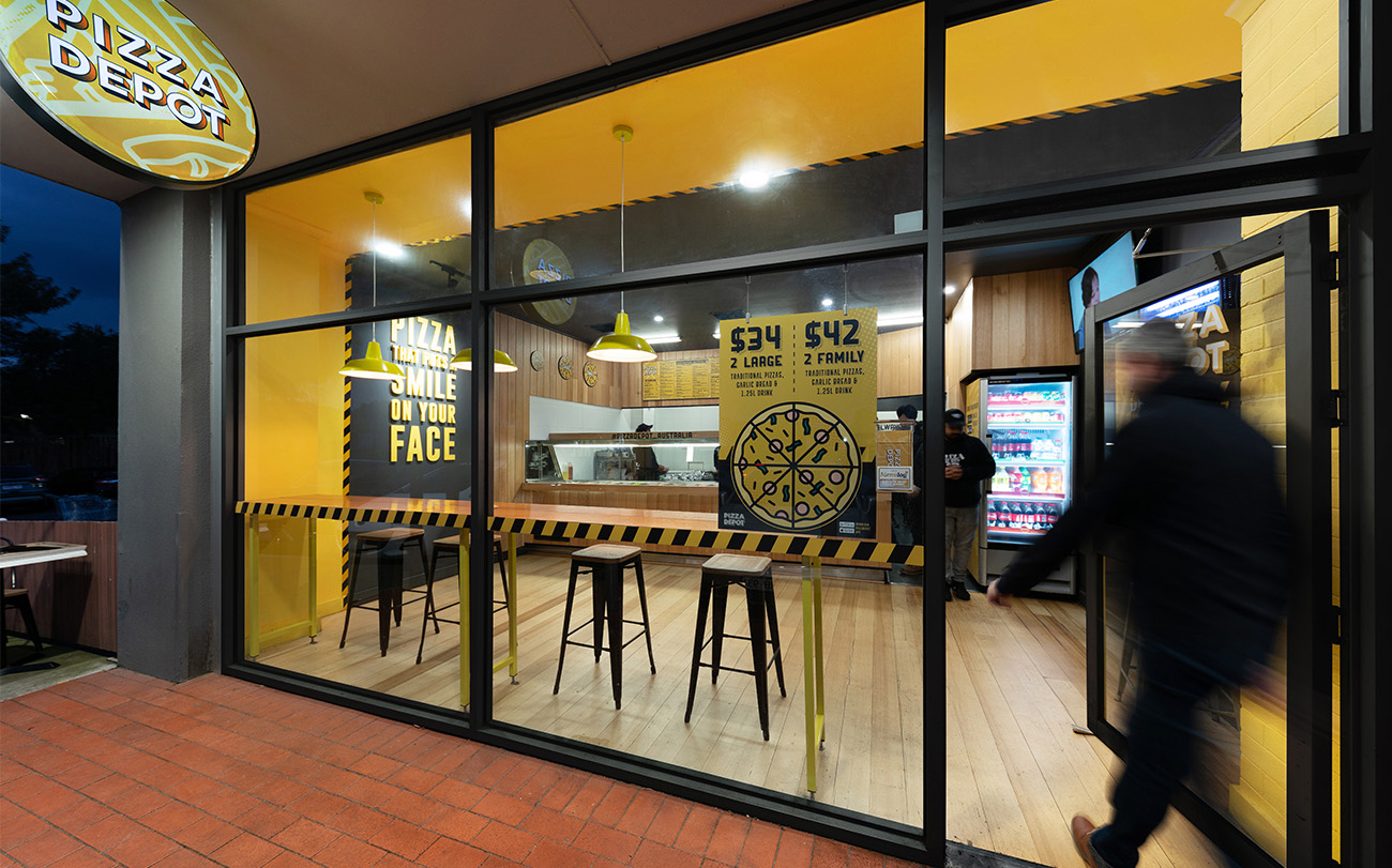
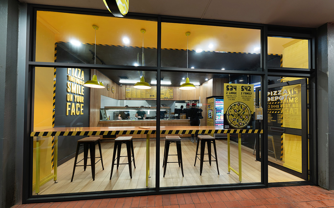
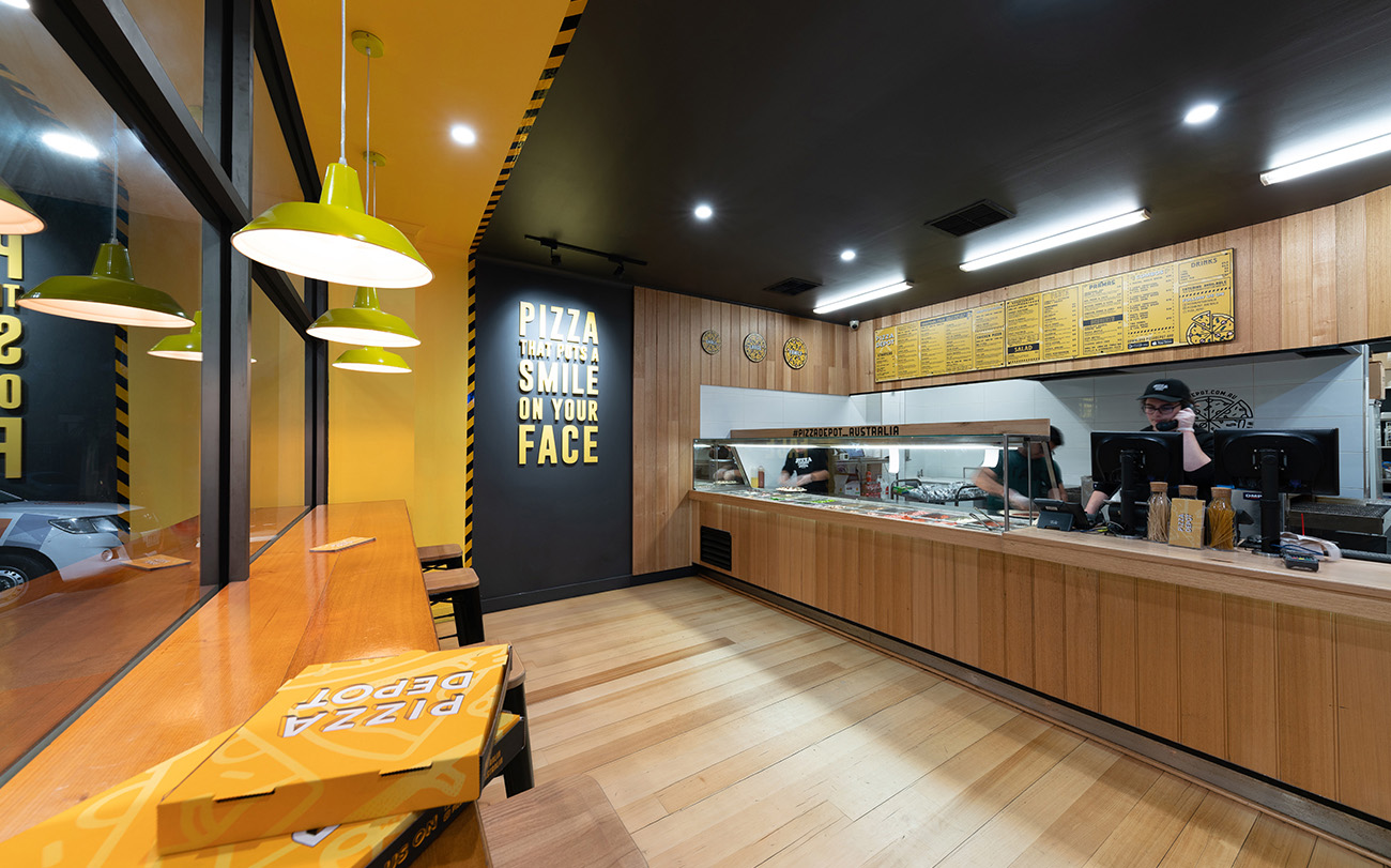
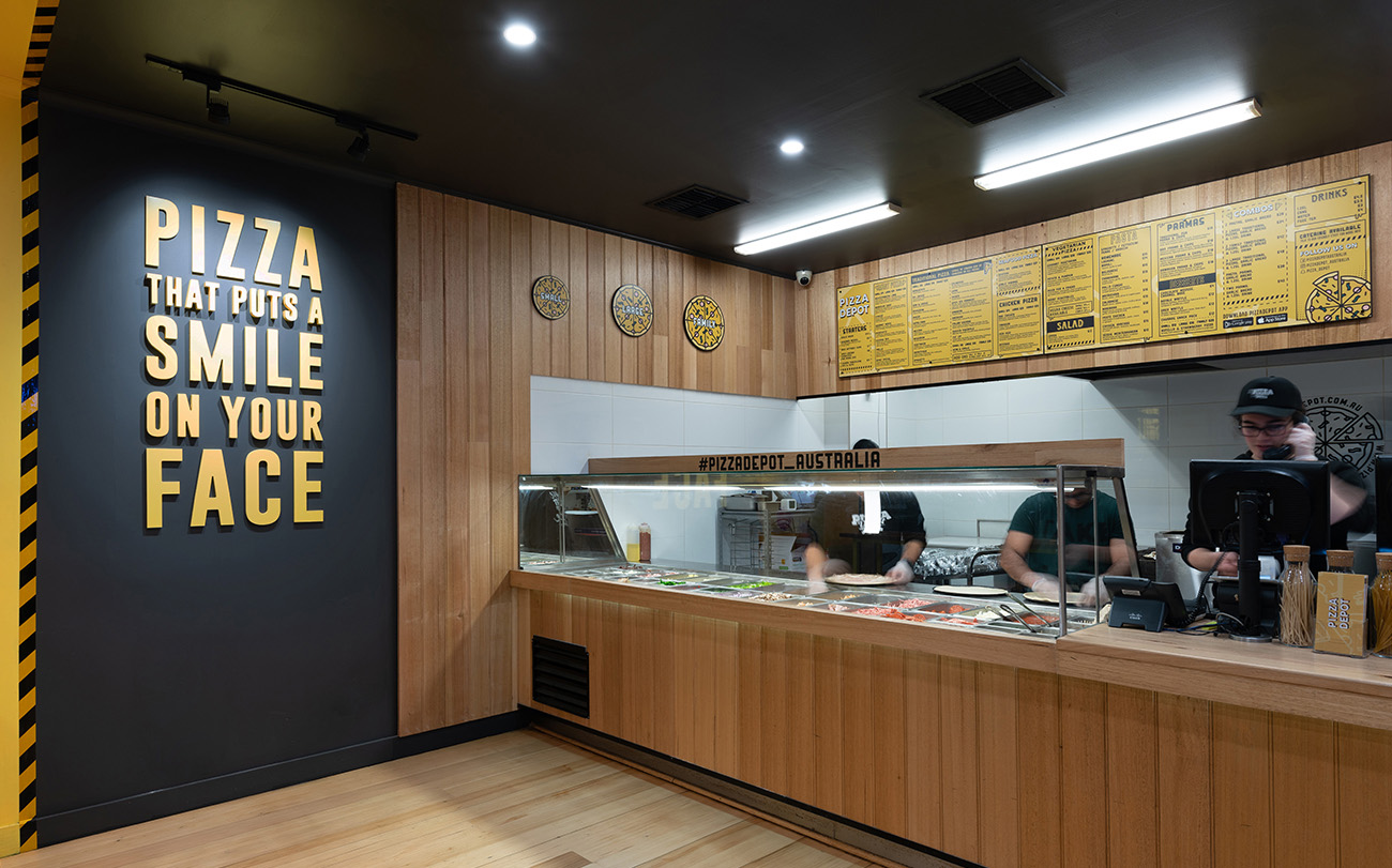
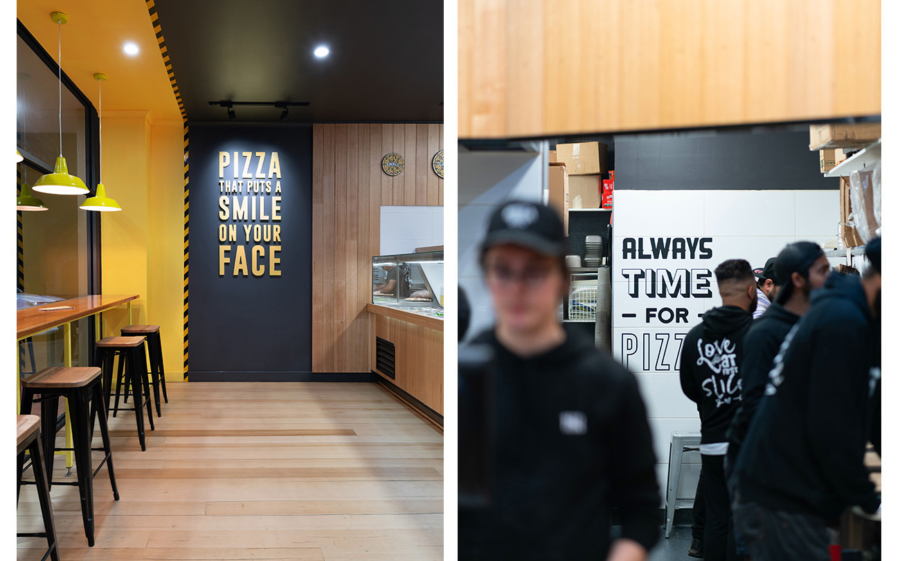
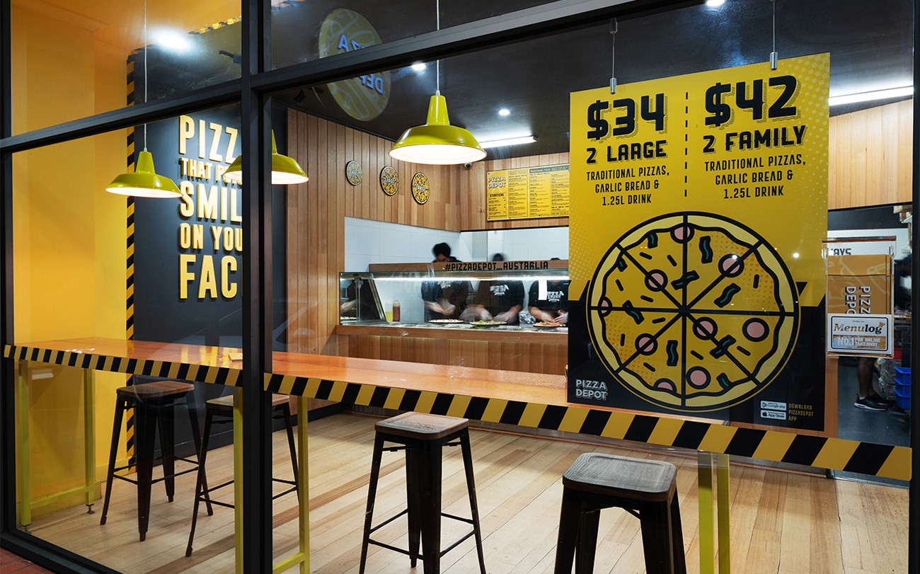
Located at the edge of a suburban shopping centre, Pizza Depot’s frontage addresses the adjacent car park with a bold new face. Reimagined by Benjamin Fretard of Fretard design, the re-design of the existing 70 square-metre retail shop front was envisioned to establish a presence in the area: to be immediately visible and distinctly recognizable. Grounded in a conservative budget, Fretard Design employed considered material and design strategies to make impactful statements, using unconventional techniques. Interrogation of the business name conjured industrial images of factories and warehouses, and so safety tape was used to edge joinery elements and segment changes in finishes. Staying within the bold black and yellow hues, the safety tape graphic was magnified, becoming two distinct bands of colour that funnel customers from the entry towards the warmth of the timber-lined counter and wall beyond. Focused on delivering a holistic concept, Fretard Design was also tasked with designing the store’s new branding and graphics, seamlessly intertwining the interior expression with a new brand identity. The choice of wall linings sought to create considered surfaces on which signage could be positioned and clearly read, with a playful mix of fonts and illustrative styles further enhancing the space. Fretard Design established future design principles within the fitout to allow the brand to be reproduced in other spaces, as part of the potential for business expansion. Helping the client establish their profile through a unique aesthetic was integral to Pizza Depot’s success, and something both designer and client collaborated closely on to create a bold new persona with a vibrantly bright future.


