Interior Melbourne Hoa House
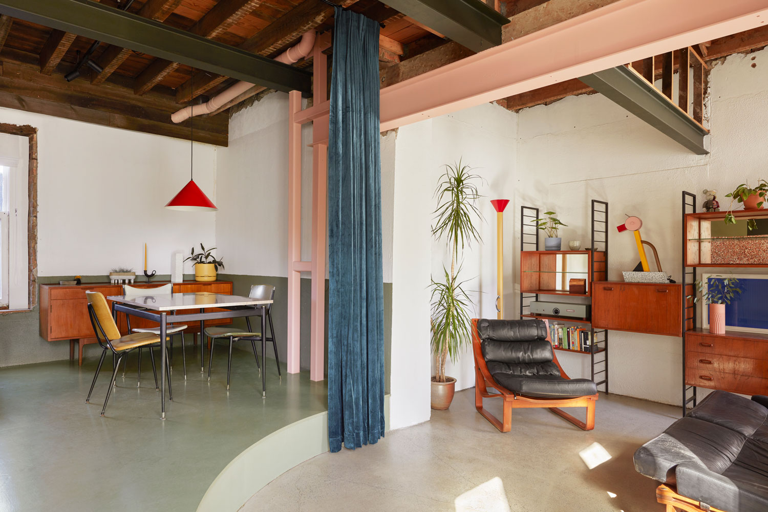
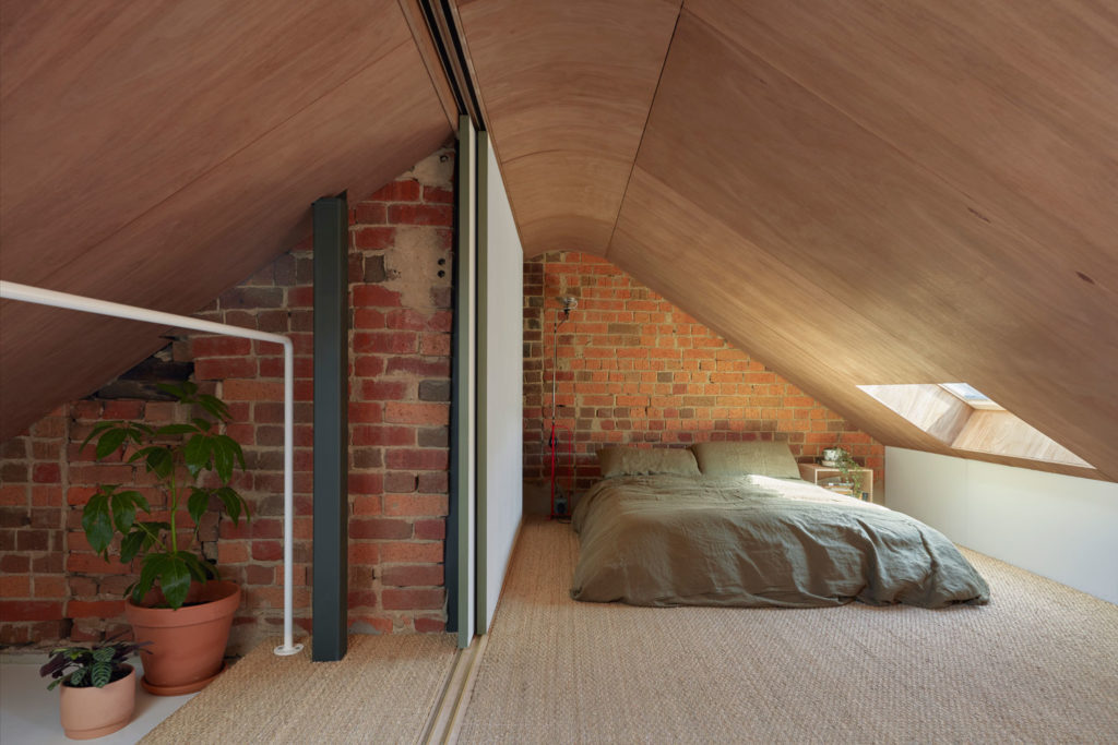
Interior Melbourne Hoa House the emerging design practice ioa studio transformed a dull office space, once an old pub, into a warm and playful home brimming with personality. “Our friend Hoa took a huge risk and bought the oldest building she could find,” said Amy Bracks and Miles Ritzmann-Williams of ioa studio. Not only did the 150-year-old building not have a straight bone in it, the renovation budget was limited. ioa studio began by ripping out the entire existing fitout, making the most of free labour from family and friends. “We wanted to create a sense of height, and add a third hidden bedroom into the existing roof space,” said the young designers. By removing the ceiling structure, they created enough height for a bedroom that sits on top of the open mezzanine. Curves became the perfect planning mechanism that enabled them to divide the small and awkward spaces, also a nod to the existing archway that once connected the old pub to the adjacent boarding house.
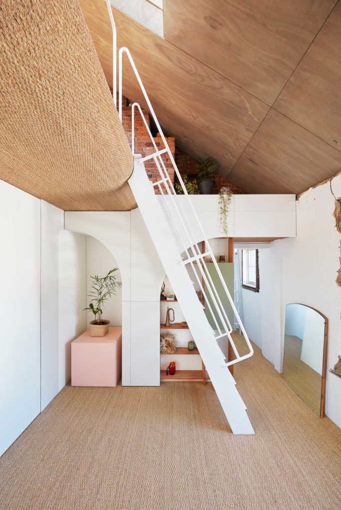
Due to the unusual nature of the building, the builder was reluctant to sign a fixed contract. This enabled the young designers a rare opportunity to work hands-on alongside the builder and complete some of the onsite work themselves. During the demolition process, Amy and Miles discovered the building’s many relics – from old candle holders to massive bluestone lintels. “The building gave us the chance to revive parts of the old pub that had sadly been covered up.” They go on to explain that “by being on site so much, we were able to discover and create many unexpected moments from a pull-out kitchen island bench to hidden mezzanine reading area.”
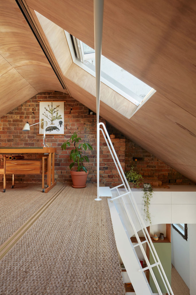
But of course, working in a 150-year-old building came with its fair share of unforeseen challenges, from crumbling bricks to downpipes running straight through future bedrooms. Nevertheless, these hurdles made the project team even more resourceful in finding compelling solutions. “The clients taste for a different colour and texture palette forced us to break out and come up with something very unusual,” said the designers, who settled on a colourful and tactile material palette for the interior. Seagrass lines the ceiling and flooring of the mezzanine level, army green and pastel pink add refreshing accents of colour, while the heavy velvet curtain acts as a divider between dining and living area – an antidote to the roughness of the existing cracking walls.
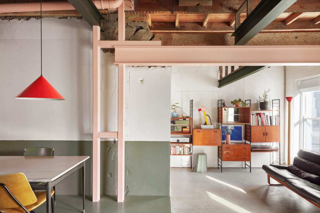
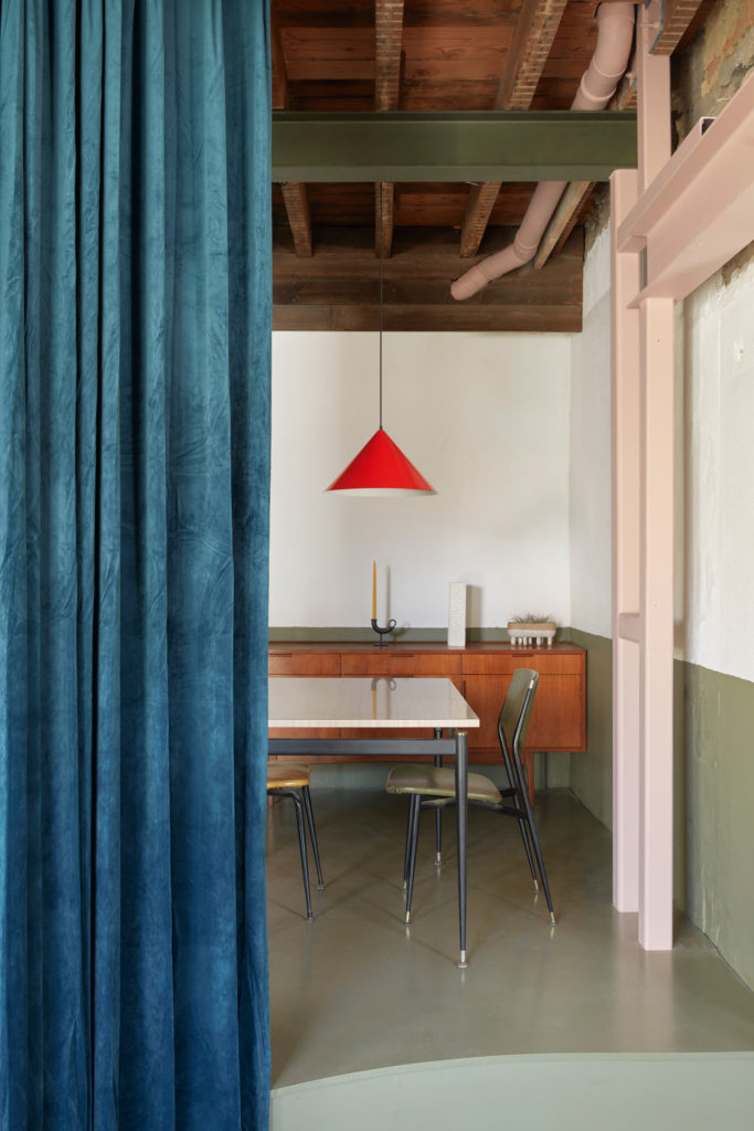
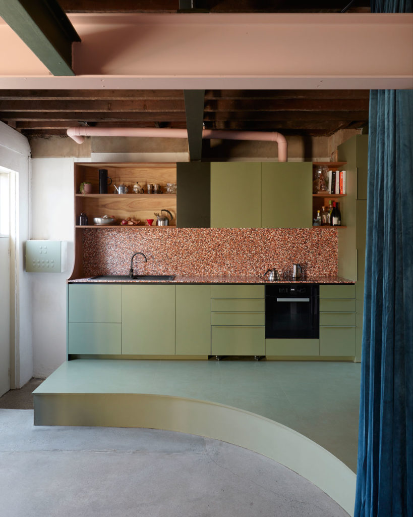
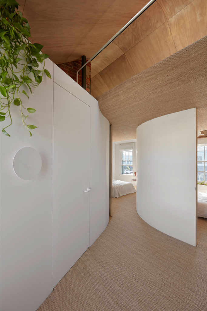
“We used the small space to our advantage to create warmer, cozier living areas while using colours of the Australian bush to [design] exciting interior Melbourne to be in,” said the designers. They used colours and materials as a device to define different areas within the house, allowing them to keep the small space as open as possible. If you were to read the high-level facts about this project – an old pub building found in a dull state, limited budget, young designers, unconventional building contract – you’d be right to jump to the conclusion this project was doomed from the outset. Yet the result couldn’t be further from it. Not only that – this cosy home stands as a fine example that a fighting spirit and a willingness to succeed are the critical ingredients for any successful interior outcome. Massive respect.
Source:https://www.yellowtrace.com.au/ioa-studio-hoa-house-melbourne/


